We’ve Talked About Homicide In Chicago At Least One Million Times But I Don’t Think This Has Come Up
Here are two maps:
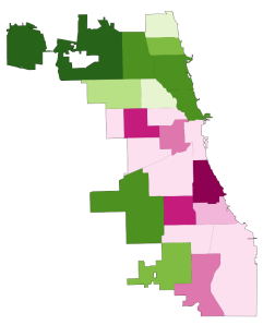
HOMICIDE RATE BY POLICE DISTRICT
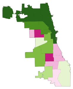
Like the captions say, the one on the left shows homicide rates by police district in the early 90s, when crime was at its peak in Chicago, and the one on the right shows the same thing, but about two decades later.* The areas in dark green are the safest; the ones in dark pink are the most dangerous. The colors are calibrated so that green areas are safer than average for the early 90s, and pink ones are more dangerous than average for the early 90s. The 2008-2011 map keeps the same calibration: green is safe compared to the early 90s, so that you can see change in the levels of violence over time.
And, indeed, the first thing that jumps out from these maps is that there’s way more green nowadays, and it tends to be darker. The city is way safer! Some areas we might consider a bit dicey today – like, say, the Lawndale/Little Village area – actually register as light green, meaning that by early 90s standards, they would be considered relatively safe.
[For those of you craving numbers, the murder rate averaged 30 per 100k during the first period, and 17 per 100k during the second, a decline of nearly 50%.]
Of course, the other thing we notice is that there are some very distinct patterns to safety. These maps are breaking exactly no news by indicating that the more dangerous parts of the city are on the West and South Sides, but it is striking, I think, to see that nowadays, basically the entire North Side is the darkest green, which translates to a homicide rate of less than 6 per 100k. In fact, the dark-green part of the city has a murder rate of 3.3 per 100k.
Three point three. In New York City, which is constantly (and mostly correctly) being held up as proof that urban safety miracles can happen in America, it’s 6.3. Toronto, which as far as North American big cities go occupies a fairy tale land where no one hurts anybody, had a homicide rate of 3.3 per 100k as recently as 2007. The North Side is unbelievably safe, at least as far as murder goes.
But there are none of the darkest green on the West or South Sides. There’s actually a fair amount of pink, meaning places that are relatively dangerous even by the terrifying standards of the early 90s.
This raises a question: Has the great Crime Decline benefited the whole city equally? Are the South and West Sides still relatively dangerous because they started from such a bad place, or because they haven’t seen nearly as much of a decline as the North Side has?
Here is the answer in another map:
CHANGE IN HOMICIDE RATE, EARLY 90s – LATE 2000s
The areas in darkest green saw the greatest decline; red means the murder rate actually increased.
Click to read the article


